Christi and I were able to explain our semester-long hard worked project very thoroughly (3times), and got numerous feedback to push us forward for our portfolio and upcoming senior show next week.


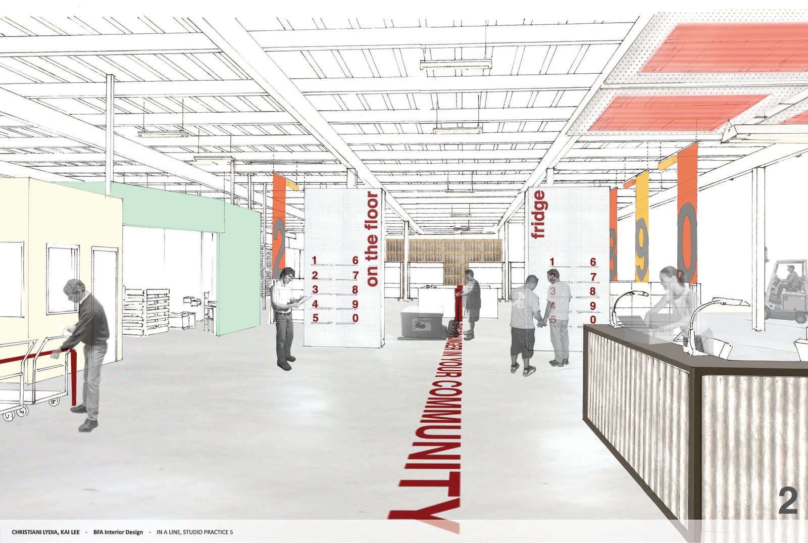

Presentation Layout: Easy to follow, even without us presenting to the viewer. Clear, simple layout and sequence of each images led a completed presentation. Our rendering technique was simple but tells a spatial quality and experience that we wanted to communicate to the viewer, and our experience sequence models created three dimensional depth for the presentation. However one of the jurors, Megan Warner (CCA Interior faculty), commented that sequence model only speaks of physical experience so far, and we should mix two dimensional information of spatial context with three-dimensional model to tell complete experience, both spatial and physical, to the viewers. At that moment, Christi and my eyes were open wide with excitement to develop these models further (It will be up for the senior show:) ) A diagram about how space users can get nutritional information in the ACCFB warehouse was very effective to communicate our idea of connecting shopping and nutrition education.
Project Content: Supergraphic with paint in such a big space, warehouse, is affordable and effective. But rather than a line imposing one idea, it can be expanded way further, such as becoming a way-finding graphics, creating a complete ACCFB narrative to educate the visitors. Shopping display using numbers (1-10) and alphabet (A-J) can be confusing. For example when both screen 1 and A are down, people might misunderstand A as a subcategory item of item 1. So instead of numbers, alphabet can might give more flexibility without confusing the users since there's 26 letters in alphabet.
Our client representative, Suzan Bateson, executive director at ACCFB, listened our presentation very attentive, and hope she was happy with our project development after all. Christi and I were very happy how the project turned out, and certainly because we're released from final pressure. X)
No comments:
Post a Comment