Friday, May 6, 2011

CCA Interior Design Senior Exhibition 2011

We're having our Interior Design Senior Exhibition at Gensler SF office. Our theme of the invitation poster is "CCA Interior studio engaging SF Bay area." As we studied interior design for 6 semesters at CCA, we had several opportunities to contribute our education and design skills to community we live, and work with real clients. We're all proud to celebrate our most advanced work and success with family, friends and design community. I'm gonna miss my colleagues and our S14 studio and CCA SF campus.

Thanks for everyone to brainstorming idea for  the invitation together and give special extra thanks to Elise Gonzalez for helping me with layout!

Please join us celebrating all our success this coming Tuesday night :)


ACCFB Shopping Sequence Model

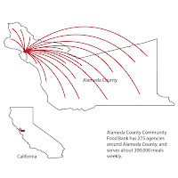
Alameda County Community Food Bank's shopping is different than regular grocery shopping experience. 275 agencies (soup kitchens, child care center, senior centers, etc) shop at food bank. Our sequence model explains the shopping experience in My group's design.

Final Presentation on May 1st

We had our LAST critique from California College of the Arts as students on last sunday afternoon. We tried a new style of critiques using Bruce Gallery at CCA. With Amy(SP5 instructor)'s initiative and SP5's active input to hear the most feedback from jurors, we wanted somewhat informal and conversational critique. So we let our jurors to walk around our works freely for 30 minutes, and we presented to couple of jurors at a time about 3 rounds. We were able to hear valuable feedback from all different perspectives, and it was very thorough. Also I was able to hear my classmates' presentations, share feedbacks and presentation/ technical techniques. 


Christi and I were able to explain our semester-long hard worked project very thoroughly (3times), and got numerous feedback to push us forward for our portfolio and upcoming senior show next week.


Presentation Layout: Easy to follow, even without us presenting to the viewer. Clear, simple layout and sequence of each images led a completed presentation. Our rendering technique was simple but tells a spatial quality and experience that we wanted to communicate to the viewer, and our experience sequence models created three dimensional depth for the presentation. However one of the jurors, Megan Warner (CCA Interior faculty), commented that sequence model only speaks of physical experience so far, and we should mix two dimensional information of spatial context with three-dimensional model to tell complete experience, both spatial and physical, to the viewers. At that moment, Christi and my eyes were open wide with excitement to develop these models further (It will be up for the senior show:) ) A diagram about how space users can get nutritional information in the ACCFB warehouse was very effective to communicate our idea of connecting shopping and nutrition education.


Project Content: Supergraphic with paint in such a big space, warehouse, is affordable and effective. But rather than a line imposing one idea, it can be expanded way further, such as becoming a way-finding graphics, creating a complete ACCFB narrative to educate the visitors. Shopping display using numbers (1-10) and alphabet (A-J) can be confusing. For example when both screen 1 and A are down, people might misunderstand A as a subcategory item of item 1. So instead of numbers, alphabet can might give more flexibility without confusing the users since there's 26 letters in alphabet.  


Our client representative, Suzan Bateson, executive director at ACCFB, listened our presentation very attentive, and hope she was happy with our project development after all. Christi and I were very happy how the project turned out, and certainly because we're released from final pressure. X)

Saturday, April 16, 2011

Design Development: Desk Critique with Sanjit Sethi and Chip Minnick

We only have about two weeks left until our final review, May 1st. Time flies so fast, and it's about time to finalize the design and produce drawings, renderings, and make models. Since everybody's design has changed/improved since the midterm review, we wanted a desk critique with Sanjit Sethi from CCA Engage program who organized this project and gave a critical review at the midterm, and Chip Minnick, CCA interior faculty.


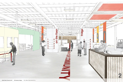
After our midterm review, Christi and I changed our design quite a bit, response to our midterm review. Rather than exposing too much of in-house operation of the food bank, we decided make our shopping area as a focal point. There's still visual access that we wanted from the beginning design process, but now we are creating hierarchy on shopping area which won't distract shopper's circulation. Also we brought in a part of nutritional education program, demo-kitchen, to the shopping area. Nutritional education/consulting locates by shopping area, and it's open to view from the entry.


Chip had a critical view to our budget of $90,000. He suggested us to think about strategies that we can re-think about materials that is cheaper but has similar characteristics, reduce labor cost by suggesting volunteer program and make building components to be easily assembled by anyone.


Sanjit gave us few critical comments that Christi and I wasn't aware before. His first question was about what happens to shopping display when there's more than 10 items on the floor. He told us to think about ways that shopping could be expanded/contracted just by the food bank staff. The second question was about our nutritional education/consulting desk by the shopping area. The countered space embeds an interaction of a party behind of the counter give information to another party on the other side. He advised us to think about how we can create this interaction to be mutual between the food bank staff and the shopper.


Design Development: Entry view

Monday, April 11, 2011

Design Development: After Midterm

On midterm on March 16th, My group presented three design schemes with details of two focused area of  reception and shopping area. We, my group (I&Christi) and entire class, had a valuable critique from many jurors including Suzan Bateson, executive director at ACCFB, and CCA faculties. There were great comments to rethink our design strategies over the spring break.


Juror comments are:
• Shopping at the Food Bank is not a typical shopping experience: 
1. Targeted user: Agencies including soup kitchens, food pantries, child-care centers, senior centers, after-school programs and other community-based organizations
2. Agency shoppers usually bring in their shopping list to purchase and their alloted time to shop is 30minutes
3. Product availability: Product on sale can be different everyday
• By understanding the shopping experience at the Food bank, we can develop design strategies which expresses ACCFB's narrative
• Highlight important interaction in the space so that the space user understands the mission of ACCFB.
• Meaning of Food donation barrel: what is the conceptual meaning behind, and translate it in the design conceptually. 
• Think about warehouse as a 'big box' and the design strategy as the 'big idea'
• Efficiency as a goal, but not as a design strategy: it should be an overarching goal
three options for Detailed Areas: Reception desk and Shopping display 

Saturday, March 26, 2011

Inspirational Precedent Studies

Design Inspirations

1. Dry erase partition wall: idea of wall partition for the meeting area
2. Westminister Academy, London: Bold graphic that captures viewer's attention while it has message
3. Eataly Grocery Store Display: Color, aggregation and display
4. Project Lab at the Academy of Science, San Francisco: Public display of working operation of the facility
5. Floor graphic in the subway station: Use of floor graphic 
6. Produce display: Color, aggregation and display


Friday, March 25, 2011

Design Proposal & Strategies

My group(Christi Lydia & I) determined that we want to extend public zone and office while the new design proposal doesn't interfere with the important circulation path of the warehouse. Also open office area to public zone so that there is more frequent interaction between different type of users (Agency shoppers, donors, ACCFB staffs)

The goals of the project are:
  • Provide clear way-finding by direct line of visual access
  • Maintain and improve the existing access system
  • Orient the user's view toward ACCFB's narrative graphic and working operation
  • Efficient space usage according to change of programs by movable furniture
  • Encourage interaction between different types of users


1. Existing Zone 
2. Proposal & Area of Focus


3. Programming


Design Opportunity & Three Initial Design Schemes

Through site analysis, we determined the areas of design opportunity.


Our three initial design schemes were followed by existing site conditions such as lighting, program adjacencies, circulation and level of interaction happening on the site.


Existing Site Photos

1. Shopping Entrance - Reception - Shopping Area - Warehouse Area

2. Shopping Area


Site Analysis: ACCFB Warehouse

To set our goal of the project and set up design strategies,  our class visited the ACCFB one more time, and represented our observation graphically through diagrams. 


1. Site Photos


2. Circulation
Forklift is in a state of flux in the warehouse, and it is important to keep existing forklift's moving path clear for safety and ACCFB's efficiency and convenience. Likewise, Loading zone should be cleared out as well. 
Public or agency shoppers are allowed in the shopping area where faces the main automatic sliding doored entrance, and each shoppers get 30 minutes of shopping time, and only 3 persons are allowed at a time.

3. Visual & Program Accessibility
As program locates further in from the main entrance of warehouse (shopping reception area), only ACCFB staffs can access and is more private. People have visual access through windows and places that are not blocked by structures. 

Thursday, February 24, 2011

ACCFB Narrative II

Programatic scenario vignette for ACCFB. 
This vignettes idea is to encourage social interaction between various type of space users so that ACCFB will have stronger relationship within the facility, and further out to Alameda community.

Monday, February 21, 2011

ACCFB Narrative I

Representation of Alameda County Community Food Bank narrative


Monday, February 14, 2011

Storage System Design (Cont'd)


Social-AID event equipment storage system for Alameda County Community Food Bank

This storage system design functions as event equipment storage and event booth. This design's intention is to provide temporary space to encourage social engagement in the community through ACCFB's events such as nutritional class, cooking class, or lunch serving programs as well as storage for event equipments. 

The top compartment stores light equipments such as disposable utensils and plates, the middle compartment has folding chair racks, and the bottom one's for folding tables. One of the features is the adjustable shelving using the idea of pin art toy. Because the pins can be pushed in exact shape of the object, it can be adjustable as what object's being stored temporarily. It also acts as interactive toy to encourage interaction between users. 

The apparatus is simple rectangular shape so that it can be horizontally stacked or aligned along the wall when it's not in use.


Monday, February 7, 2011

Site Visit: ACCFB


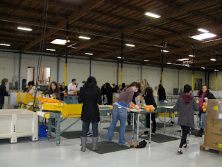
Our class visited Alameda County Community Food Bank on February 2, 2011. As we visit the site, we volunteered for sorting and packaging of fresh oranges. We conducted interviews with other volunteers and toured the facility for better understanding of existing conditions of ACCFB and their needs.

Storage System Design


Monday, January 24, 2011

Storage Design Precedents + Initial Idea sketch


  We're developing a detailed design proposal for a storage system as our first project of the semester. We start to formulate an agenda for addressing the Alameda County Community Food Bank's design needs by this exercise.
  Design Criteria:

  • The system must be contained with 260 cubic feet
  • The system must store at least three different materials related to the ACCFB programs we will be addressing (office storage, food storage, event storage)
  • The system must accommodate human access (circulation) to all areas of the system
  • The system must be free-standing and floor supported
  • The storage system must be adjustable in 3 different ways
  • The system must accommodate long-term storage (items stored for 6months or longer) and short-term storage (items stored for anytime from 1hour to 6months)
  • Remember ACCFB's context: a very actively used warehouse, constantly in flux

Selected design precedents are to frame my approach to this problem. My initial interests in this project are spatial efficiency, organization and multi functionality.

CCA Interior Engage Studio: Alameda County Community Food Bank

http://www.daylife.com/photo/0aXpbn56Sz6tA


CCA Interior senior studio (class '11) challenges to another CCA Engage project real project for Alameda County Community Food Bank(ACCFB). We will be developing design strategies for the renovation of food storage, collection and distribution of food, office and event storage, staff and volunteer kitchens, nutritional education facilities, and shopping facilities at the site of the ACCFB in Oakland, CA, as well as, identifying environmental graphic branding and way-finding opportunities throughout the facility.