Saturday, April 16, 2011

Design Development: Desk Critique with Sanjit Sethi and Chip Minnick

We only have about two weeks left until our final review, May 1st. Time flies so fast, and it's about time to finalize the design and produce drawings, renderings, and make models. Since everybody's design has changed/improved since the midterm review, we wanted a desk critique with Sanjit Sethi from CCA Engage program who organized this project and gave a critical review at the midterm, and Chip Minnick, CCA interior faculty.


After our midterm review, Christi and I changed our design quite a bit, response to our midterm review. Rather than exposing too much of in-house operation of the food bank, we decided make our shopping area as a focal point. There's still visual access that we wanted from the beginning design process, but now we are creating hierarchy on shopping area which won't distract shopper's circulation. Also we brought in a part of nutritional education program, demo-kitchen, to the shopping area. Nutritional education/consulting locates by shopping area, and it's open to view from the entry.


Chip had a critical view to our budget of $90,000. He suggested us to think about strategies that we can re-think about materials that is cheaper but has similar characteristics, reduce labor cost by suggesting volunteer program and make building components to be easily assembled by anyone.


Sanjit gave us few critical comments that Christi and I wasn't aware before. His first question was about what happens to shopping display when there's more than 10 items on the floor. He told us to think about ways that shopping could be expanded/contracted just by the food bank staff. The second question was about our nutritional education/consulting desk by the shopping area. The countered space embeds an interaction of a party behind of the counter give information to another party on the other side. He advised us to think about how we can create this interaction to be mutual between the food bank staff and the shopper.


Design Development: Entry view

Monday, April 11, 2011

Design Development: After Midterm

On midterm on March 16th, My group presented three design schemes with details of two focused area of  reception and shopping area. We, my group (I&Christi) and entire class, had a valuable critique from many jurors including Suzan Bateson, executive director at ACCFB, and CCA faculties. There were great comments to rethink our design strategies over the spring break.


Juror comments are:
• Shopping at the Food Bank is not a typical shopping experience: 
1. Targeted user: Agencies including soup kitchens, food pantries, child-care centers, senior centers, after-school programs and other community-based organizations
2. Agency shoppers usually bring in their shopping list to purchase and their alloted time to shop is 30minutes
3. Product availability: Product on sale can be different everyday
• By understanding the shopping experience at the Food bank, we can develop design strategies which expresses ACCFB's narrative
• Highlight important interaction in the space so that the space user understands the mission of ACCFB.
• Meaning of Food donation barrel: what is the conceptual meaning behind, and translate it in the design conceptually. 
• Think about warehouse as a 'big box' and the design strategy as the 'big idea'
• Efficiency as a goal, but not as a design strategy: it should be an overarching goal
three options for Detailed Areas: Reception desk and Shopping display 

Saturday, March 26, 2011

Inspirational Precedent Studies

Design Inspirations

1. Dry erase partition wall: idea of wall partition for the meeting area
2. Westminister Academy, London: Bold graphic that captures viewer's attention while it has message
3. Eataly Grocery Store Display: Color, aggregation and display
4. Project Lab at the Academy of Science, San Francisco: Public display of working operation of the facility
5. Floor graphic in the subway station: Use of floor graphic 
6. Produce display: Color, aggregation and display


Friday, March 25, 2011

Design Proposal & Strategies

My group(Christi Lydia & I) determined that we want to extend public zone and office while the new design proposal doesn't interfere with the important circulation path of the warehouse. Also open office area to public zone so that there is more frequent interaction between different type of users (Agency shoppers, donors, ACCFB staffs)

The goals of the project are:
  • Provide clear way-finding by direct line of visual access
  • Maintain and improve the existing access system
  • Orient the user's view toward ACCFB's narrative graphic and working operation
  • Efficient space usage according to change of programs by movable furniture
  • Encourage interaction between different types of users


1. Existing Zone 
2. Proposal & Area of Focus


3. Programming


Design Opportunity & Three Initial Design Schemes

Through site analysis, we determined the areas of design opportunity.


Our three initial design schemes were followed by existing site conditions such as lighting, program adjacencies, circulation and level of interaction happening on the site.


Existing Site Photos

1. Shopping Entrance - Reception - Shopping Area - Warehouse Area

2. Shopping Area


Site Analysis: ACCFB Warehouse

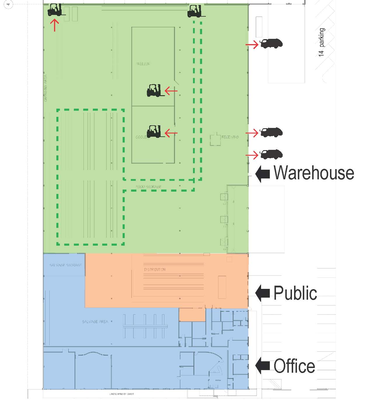
To set our goal of the project and set up design strategies,  our class visited the ACCFB one more time, and represented our observation graphically through diagrams. 


1. Site Photos


2. Circulation
Forklift is in a state of flux in the warehouse, and it is important to keep existing forklift's moving path clear for safety and ACCFB's efficiency and convenience. Likewise, Loading zone should be cleared out as well. 
Public or agency shoppers are allowed in the shopping area where faces the main automatic sliding doored entrance, and each shoppers get 30 minutes of shopping time, and only 3 persons are allowed at a time.

3. Visual & Program Accessibility
As program locates further in from the main entrance of warehouse (shopping reception area), only ACCFB staffs can access and is more private. People have visual access through windows and places that are not blocked by structures.